Newmark Primary (formerly Lumineer Academy) is an independent primary school based in the western suburbs of Melbourne. It opened in 2016 as a first-of-its-kind school, imagined by a team of educators who wanted to make mainstream education more meaningful and relevant to the challenges of today.
Newmark Primary teaches through project-based learning. The children get messy, creative and out into the community to experience real-world problems, so that they can learn the emotional and practical skills needed to tackle them.
Staff, parents and community members were keen to create a brand that would represent the school’s unique approach, work for the school’s future growth goals and stand the test of time.
Approach
When we first met Newmark Primary, the school was known as Lumineer Academy. As it grew and evolved, the board was keen to establish a name and brand identity that represented the school’s distinct personality and teaching philosophy. Alongside developing a new name for the school, we were also tasked with creating a new visual identity, tone of voice and supporting guides to help staff consistently implement their school’s new look and sound.
Finding the right name for the school
To begin with we focused on the naming aspect of this project. We knew that finding the right name for the school would help give direction for creating the tone of voice and visual identity. We hosted two workshops with staff, one for brand positioning and the other for naming, to generate a wide variety of naming options based on key words and phrases that the staff felt resonated with the school's ethos, mission and values. We synthesised the names into a handful of options by reviewing against existing schools and education organisations, copyright, how easy the name was to pronounce, and the scalability of the name. These naming options and potential taglines were shared with the school’s staff, parents and children to get their input. Eventually, after some further school community consultation and deliberation, the school had a new name – hello Newmark Primary! – supported by a tagline and concise descriptions of the school’s philosophy, mission and values.
Tone of voice
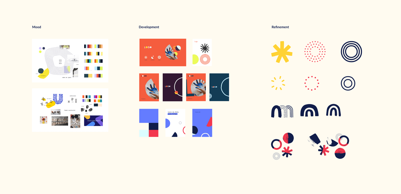
As we began to finalise the new name for the school, we moved onto the tone of voice and visual identity. We used all of the insights we had uncovered during the naming phase of the project to inform our first iterations of the tone of voice and visual identity.
We hosted two content-focused workshops, this time with staff and parents, to learn more about what they thought the school should sound like. Although these workshops were content focused, the insights we uncovered helped to inform our designers as they began to shape the visual identity of the school.
Tone of voice principles
Together with the school community we defined three tone of voice principles that summed up the school’s voice, supported by guidelines that outlined how to write in each principle, how to flex the tone of voice and tips of ensuring accessible and inclusive content.
Language system
We also created a language system for the school. This was essentially a collection of commonly-used pieces of copy, such as calls to action, email templates and points of difference that could be used on different content channels, ensuring consistency.
Visual identity
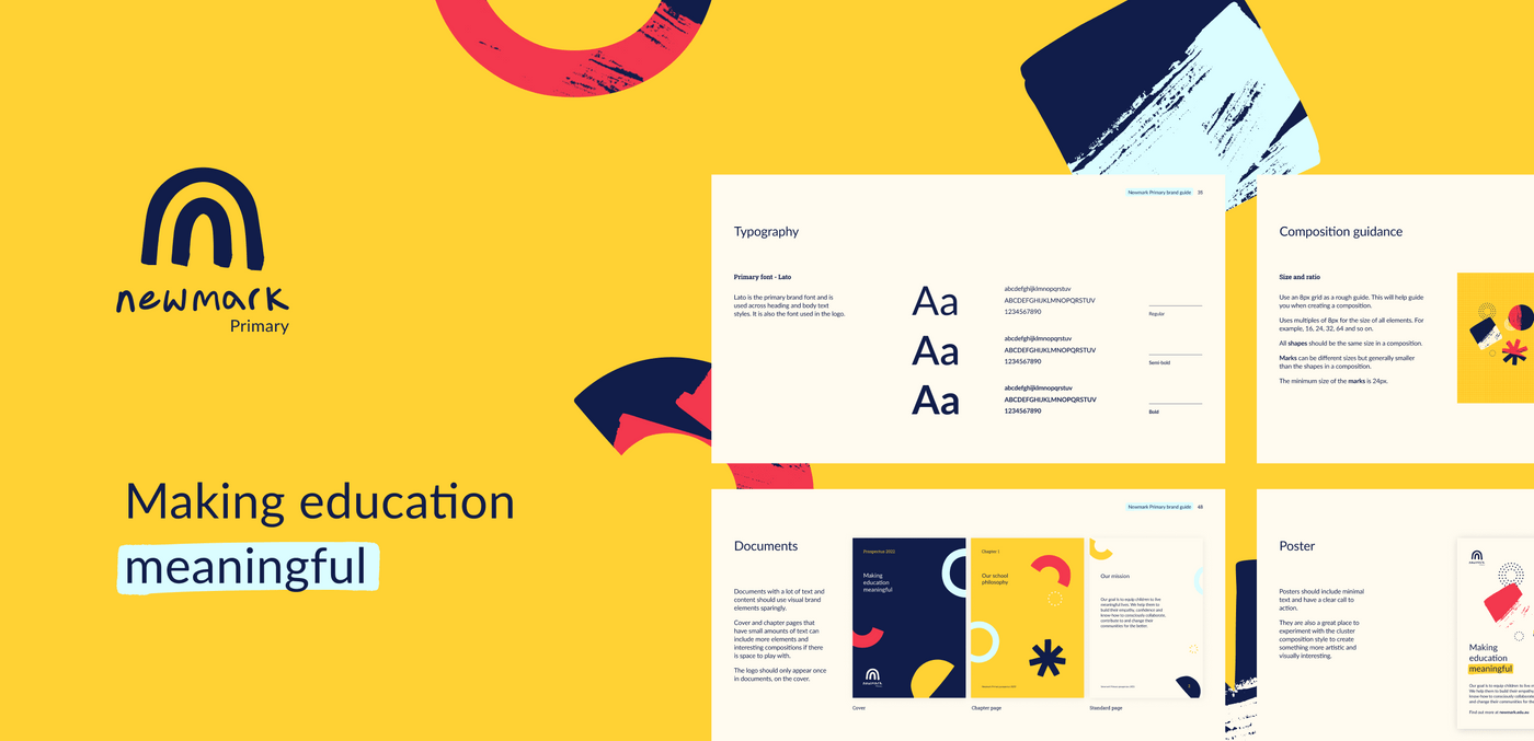
We then brought all of this research and engagement together to inform the design of a newvisual identity for the school that was grounded in the school’s new name, Newmark Primary. The brand positioning workshop we held with teachers and parents gave us three brand personality principles; inclusivity, trust, and playfulness. The brand we created has been designed to position the Newmark Primary as a forward-thinking and contemporary school. The school is not bound by traditional education models, but it is also neither experimental nor radical, so we wanted to reflect this in the way that it looks and feels. The shapes and brushstrokes, a key element of the brand we created, aim to communicate its connection to the community and the hands-on, project-based, collaborative nature of learning.
Brand guidelines
We wrapped up the branding into a comprehensive brand guidelines document and set of usable visual design assets. The aim was to give the teachers at Newmark Primary the tools to use the brand themselves, not only for creating documents but also to create unique designs using the graphic elements. The strong visual language and graphic elements can be pulled together in several ways. This ensures the brand never feels repetitive and can grow with the school into the future.
Logo
The Newmark Primary logo is made up of two parts, the logomark and the wordmark. The logomark is the focus point of the logo and represents the idea of ‘making your mark’ and visually ties back to the school’s philosophy drivers of growth, contribution and impact. It’s designed to be playful as it resembles a sun or a rainbow.

Outcomes
This project had a lot of enthusiasm and expectation from the key stakeholders, so we were happy to land on a name, tone of voice and language system, and a visual identity that aligns with the school’s philosophy and culture and is helping to set it up to succeed and grow.
The school have since launched their new brand and name on their site: newmark.vic.edu.au
Reflections
Amanda Tawhai, Principal, Newmark Primary
"We loved working with the Portable team. They competently guided us through a rapid rebrand process, and we are so proud of the end result. The school’s branding and content now clearly portrays the school’s unique philosophy and mission. Thank you Portable!"
Marty Jonas, Expansion and Growth Lead, Newmark Primary
"We're so proud of the work Portable has produced. The process was executed with the highest level of detail and customer care. Our new brand is visually beautiful and practical to use. All stakeholders were carefully considered throughout the journey, and our new brand perfectly captures who we are."
Emily Pearce, Senior Content Strategist, Portable
“It was a joy to co-design with such passionate educators and parents. People who cared deeply about the impact they had on children and the impact children had on the world.”
Project team
Lauren Manning, Senior Producer
Emily Pearce, Senior Content Strategist
Peter Roper, Senior Content Strategist
Ashlee West, Lead Experience Designer
Harrison Blackmore, Experience Designer
Download our report on designing for education
